1. Why Winter Color Schemes Are Important
Winter colors are not just a splash of color on the wall, but the emotional backdrop of the entire room.
When furniture and large items remain in neutral colors, small adjustments to color schemes are enough to transition the space from a lively holiday atmosphere to a peaceful, restrained winter rhythm.
Winter color schemes have several core purposes:
- A smooth transition from the “lingering warmth” of Christmas and New Year’s to everyday life
- Responding to the cooler light from outside with quieter tones
- Giving your home a “fresh” feel without spending a lot of money or replacing major items
2. Starting with the “Desired Atmosphere”
Before choosing colors, ask yourself: What kind of feeling do you want your home to have this winter?
Here are some common directions:
- For a more relaxed and gentler atmosphere, soft, low-saturation warm or neutral colors are suitable.
- To make your home brighter and counteract the chill of cold weather, consider light colors and bright, contrasting warm and cool tones.
- If you prefer a simple and rational style, start with clean neutral colors and a touch of contrasting colors.
Only by first determining the “mood” will you avoid blindly choosing colors or following trends.
3. Take a “Take a Walk” Around Your Home First
Instead of directly buying new items, the truly smart approach is to first “shop” for your home.
The author typically starts by looking for clues in several places:
- Pillows and pillowcase drawers: Colors and patterns often hint at personal preferences.
- Handmade or fabric corners: Leftover fabrics often reveal previously favored color schemes.
- Existing decorations in various rooms: Items that bring immediate pleasure often serve as seeds for color schemes.
This process has two advantages:
- It naturally filters out colors that the author “truly likes,” rather than those that others say look good.
- It avoids purchasing large quantities of new items, prioritizing existing resources and saving budget.

4. Based on “Two-Color Combinations”
A good winter color scheme doesn’t require a complicated formula; instead, it can start with two main colors.
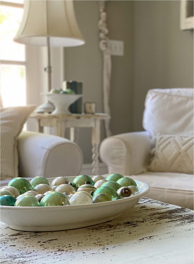
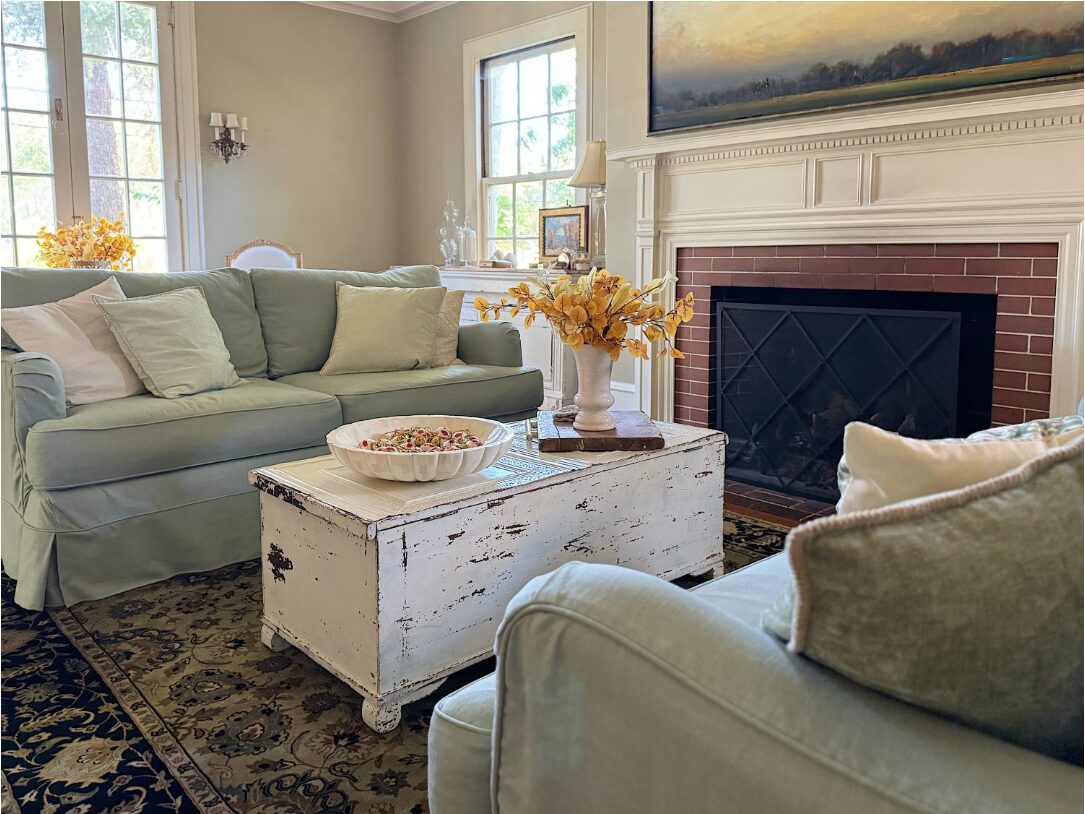
Past experience has shown that combinations like “sage green + warm gray-brown” are both pleasing to the eye and soothing.
The advantages of this simplified approach are:
- Fewer colors make it easier to keep the space clean and uncluttered.
- It facilitates maintaining the same visual logic across different rooms.
- It makes it easier to control the proportion if a third accent color is added later.
When choosing colors, you can refer to three steps:
- Use a neutral color as a base (beige, warm white, light gray, etc.)
- Choose a main color to create a mood (such as soft green, milky coffee, warm brown, etc.)
- Choose a secondary color for small-area echoing and transition.
5. Turning “Inventory” into a New Color Scheme
Once the color direction is roughly clear, you can actually “bring out” the items from each room.
The author will gather items that match the color scheme in one space and display them together like samples.
Items that can be included in a “winter color scheme plan” include:
- Fabrics such as cushions, blankets, curtains, and tablecloths
- Small decorative items such as vases, candlesticks, trays, and picture frames
- Paintings, photographs, and handmade items
When these items are placed within the same visual range, it’s immediately apparent whether the colors are harmonious and the textures are consistent.
If some items are particularly jarring, don’t force them to stay in this season’s decor.
6. The “Hidden Advantages” of Neutral-Colored Furniture
If furniture and large items are consistently kept in neutral colors like white, beige, and light gray, it provides a great deal of freedom in seasonal color schemes.
The advantage of this approach is that large items don’t need frequent replacement; the overall impression can be changed simply by using small, movable items.
This means that adjustments each season can revolve around just a few categories of items:
- Replace or layer cushion covers
- Replace or add rugs or bed runners
- Rearrange vases, tableware, and table decorations
Using large items as a “background” and small items as the “main focus” is the easiest and safest method for winter color schemes.

7. Using Color to Mask the “Emptiness” After the Holidays
After taking down holiday decorations, a room inevitably feels slightly empty, even a little lonely, as if it has been “emptied out.”
One of the tasks of winter color schemes is to use quieter but consistent colors to fill this void period.
For example:
- Use a set of cushions in the same color family but with different textures to fill the visual focal point that was previously occupied by Christmas decorations.
- Replace the places where holiday wreaths or lights used to be with one or two new decorations in matching colors.
- Rebuild the “center of gravity” of the dining table or coffee table with table flowers, candles, or pottery.
In this way, the space won’t feel cold and empty after the holiday items are removed; instead, it feels like entering a quieter, more enduring chapter.
8. Leave a Little Suspense for the New Year
When the color scheme of the previous year successfully created the ideal atmosphere, it’s easy to want to “copy it exactly.”
But the author also reminds themselves: Occasionally breaking free from habit and changing a color scheme is a gentle form of self-renewal.
You don’t need to completely overhaul your home or buy everything new. You can start with these small adjustments:
- Keep some of the old colors, replacing only one main color.
- Add an unexpected color as an accent to a familiar color scheme.
- Move some old items to different rooms to create a new feel with new combinations.
This controlled change will give each winter different memories, and your home will be constantly renewed through these subtle adjustments.
9. Let Color Truly Serve You
All advice on winter color schemes ultimately points to the same thing: Don’t ignore your own feelings in this room to please others.
Constantly ask yourself:
- Does this color make me want to sit here a little longer?
- Does it make me feel a little lighter on a gloomy day?
- Does it blend naturally with my existing objects, memories, and lifestyle?
As the answers to these questions gradually become clearer, a winter color scheme that truly suits you will quietly take shape.


